How might we support elderly Australians retain a sense of value, purpose and relevance as they transition into retirement?
Context
Summary
CLASS:
TIMELINE:
PROCESS:
TEAM:
METHODS:
Advanced Interaction Design
3 Months (Aug - Oct 2019)
User Experience Design (UXD)
Mark Scarcella, Timothy Parker, Isabella Urquhart, Nikita Sergeev
User Interviews, Personas, UX Stories, Affinity Mapping, Ideation, Storyboarding, Sketching, Prototyping, User flows, Heuristic Evaluation, User Testing, Iteration
As a major assessment in the Advanced Interaction Design class at UTS, we were asked to design a digital technology to support a chosen experience that aided elderly Australians.
We wanted to support elderly Australians transition into retirement, ensuring they maintained a sense of value, relevance and purpose – even after retirement.
To achieve this we designed a digital noticeboard as a platform for elderly Australians to share their skills, knowledge, and stories.
The challenge
Design a digital technology which builds desirable and meaningful experiences to support active aging in elderly Australians.
Problem statement
Elderly Australians exiting the workforce, many of whom are highly experienced and skilled in particular field, many find that society no longer turns to them for advice or assistance, leaving them feel dismissed, underappreciated, and overlooked.
Outcome
We designed a community-driven “noticeboard” for elderly Australians to share their skills, knowledge and stories - helping them retain a sense of value, relevance and purpose
Role
User Research & Testing
I reviewed academic articles to better understand “active aging” within Australia.
Watched 3 interviews with Australian aged over 65 on their experience with aging.
Contributed to group thematic analysis sessions - creation of affinity diagram
Established user testing protocols, testing scenarios and took on the role of Interviewer & Facilitator during our user test.
UX Design
Personally created a persona and experience stories to evoke empathy.
Contributed to group ideation sessions - personally sketched ideas, storyboards & collaborated on the system blueprint and mind map.
Defined problem statement and intended experience
Redefined user-flows for the “leaving a review” process, based on user feedback.
Reviewed user testing feedback to identify themes
UI Design
Conducted heuristic evaluation on paper prototype, proposing revisions which were then implemented on the clickable prototype.
Redesigned UI elements and hierarchy in response to user testing feedback. (Adobe XD)
The Brief
Design a digital technology which builds desirable and meaningful experiences to support active ageing in elderly Australians.

Pillars & Elements of Positive Aging
Nassir S., Leong T.W., Robertson T.: Positive Ageing Proceedings of the Annual Meeting of the Australian Special Interest Group for Computer Human Interaction on - OzCHI '15, (2015)

https://youtu.be/wgfGuhwPJhY
1. Understanding our problem & demographic
We began by trying to understand the problem - we consulted academic journals on “active ageing” and utilised earlier user interviews with elderly Australian to better their experiences.
Earlier in the year - we each a semi-structured interview with people aged over 65.
From our findings, we formed affinity maps to uncover patterns and themes.
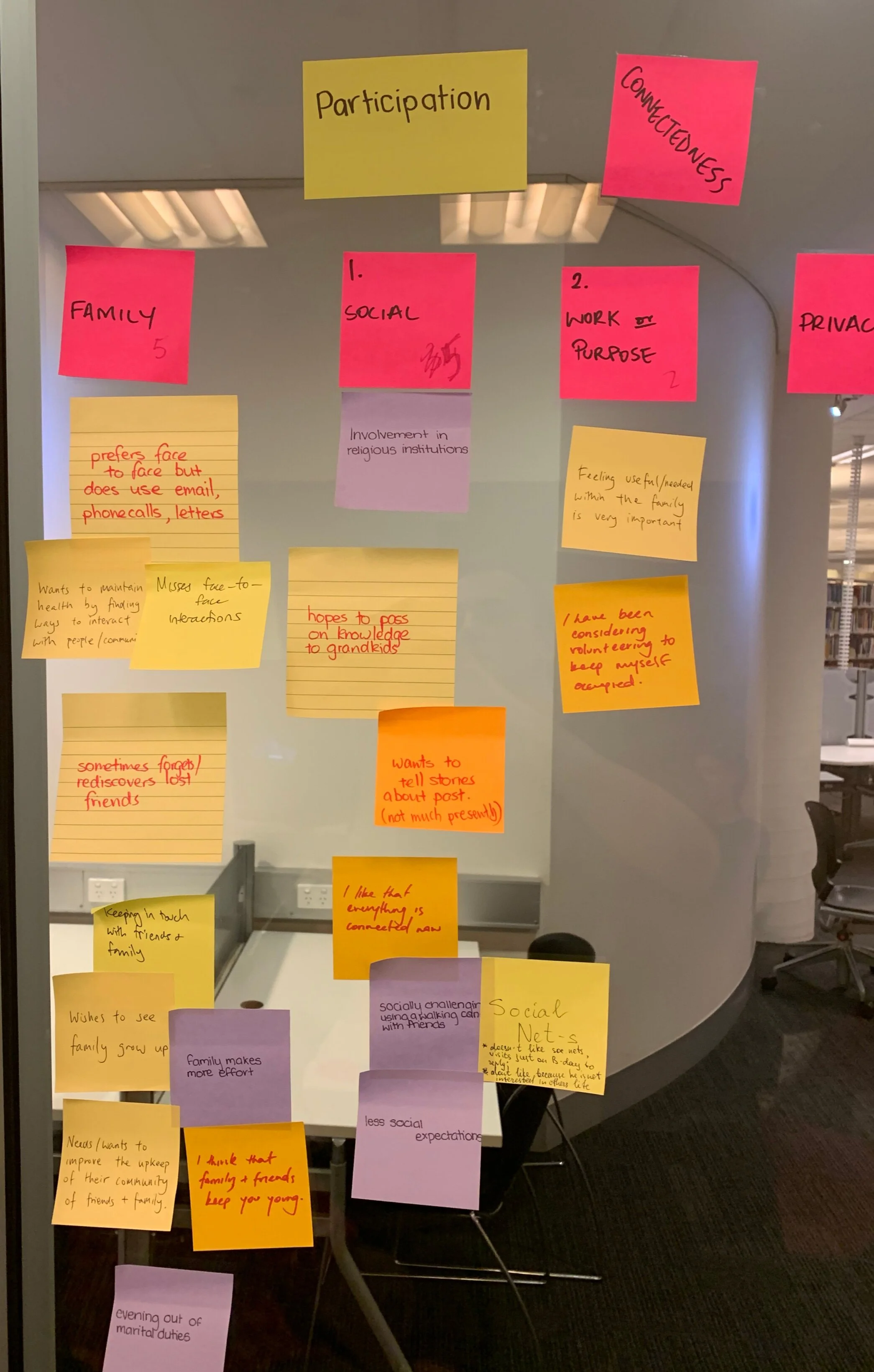
Affinity mapping to discover themes of “connectedness” in user interviews.

Early whiteboard sessions to select an area of interest.
From the findings, the team selected an area of interest.
and established a clear problem statement to guide our design.
The problem statement
As elderly Australians exit the workforce, they must fill the void of their working hours and grapple with their new identity as a retiree. Many of whom are experienced and skilled in a particular field find that society no longer turn to them for advice or assistance – leaving them feeling dismissed, underappreciated, and overlooked.
2. Creating empathy for our users
To help keep our users and their needs at the forefront of our mind, we synthesised personas.
To truly step into the shoes of our users, we penned user experiences stories - narratives which help us empathise their pain points & inspire potential solutions

UX Persona – convincing, emotional & grounded in user research UX Story
“…Dinh sipped his ice coffee with bemusement as he answered his daughter’s questions about his health. Ever since his retirement, his family had been coddling him. Granted, he wasn’t strong enough for heavy jobs, he could still look after himself just fine…”
UX Story - Problematic Experience
“…It was refreshing to have someone be interested in what he had to say – particularly his past as a veteran. The boy’s mother had baked Dinh some banana bread for his time, which he carried proudly under his arm. Dinh was warmed by the exchange, he felt valued and a sense of purpose through sharing his experiences…”
UX Story - Envisioning a positive future
3. Ideation: The formation of a big idea
In ideation sessions, we fostered an environment of collaboration and creativity – encouraging equal contribution amongst the team and pushed the potential of each idea.
We welcomed imaginative and bold thoughts, using design tarot cards for inspiration.
To keep our users close, we pinned up personas as we brainstormed.


Personas always in view during ideation
Design ‘Tarot’ Cards - by David Chung
(National Taiwan University of Science & Technology)

The noticeboard concept

Other early concepts
4. Expansion: Fleshing out the right idea
We liked the appeal of a tangible solution which could enrich public space, foster a sense community and be usable by people of all ages – so we choose to reimagine the community noticeboard.
Starting with a holistic view of a what it could be, we launched into work by creating sketches, storyboards, and diagrams to flesh out the concept and understand what it should be.

Storyboard - Experience driven solution
Mind Map - Connecting user values to potential features
System Blueprint - Elements and relationships
5. Planning the user flow & interaction points
Very early in the process, we identified that users would have two fundamental goals when interacting with the digital noticeboard – giving or receiving help. To better understand the key interactions, we created user flows to map out potential touch points.

1a. Giving help - “Lending a hand”

1b. Receiving help - “Lending a hand”

2. Leaving a review - Critical to the intended experience.
To support our two intended experience for our intended audience, the review & testimony system was also critical to the noticeboard.
At this point, UX writing & system language were revised to support the onboarding process.
6. Prototyping: pen to paper to program
Only after establishing an understanding of the whole picture and key interactions did we finally turn our focus onto the user interface.
Iterations
Prototype 1 - Paper prototype
Prototype 2 - Clickable Balsamiq prototype
Evaluation 1 -Internal Heuristic Evaluation
Prototype 3 - Clickable Adobe XD prototype
Evaluation 2 - User Testing (Wizard of Oz)
Prototype 4 - Hi-Fi Adobe XD Prototype
We produced wireframes, beginning with low commitment pen & paper sketches then moving into higher fidelity clickable prototypes using Balsamiq and Adobe XD.


Paper to program wireframes

Clickable fidelity prototype for user testing
7. User Testing (Part 1) - Internal Validation
At each iteration, the team performed in-house ‘expert’ evaluation, revising each other’s work using our knowledge of design principles & usability heuristics. Feedback was collected both through Google Forms and face-to-face.


Peer-designed prototype for evaluation


Proposed revisions - Quick sketches to communicate ideas
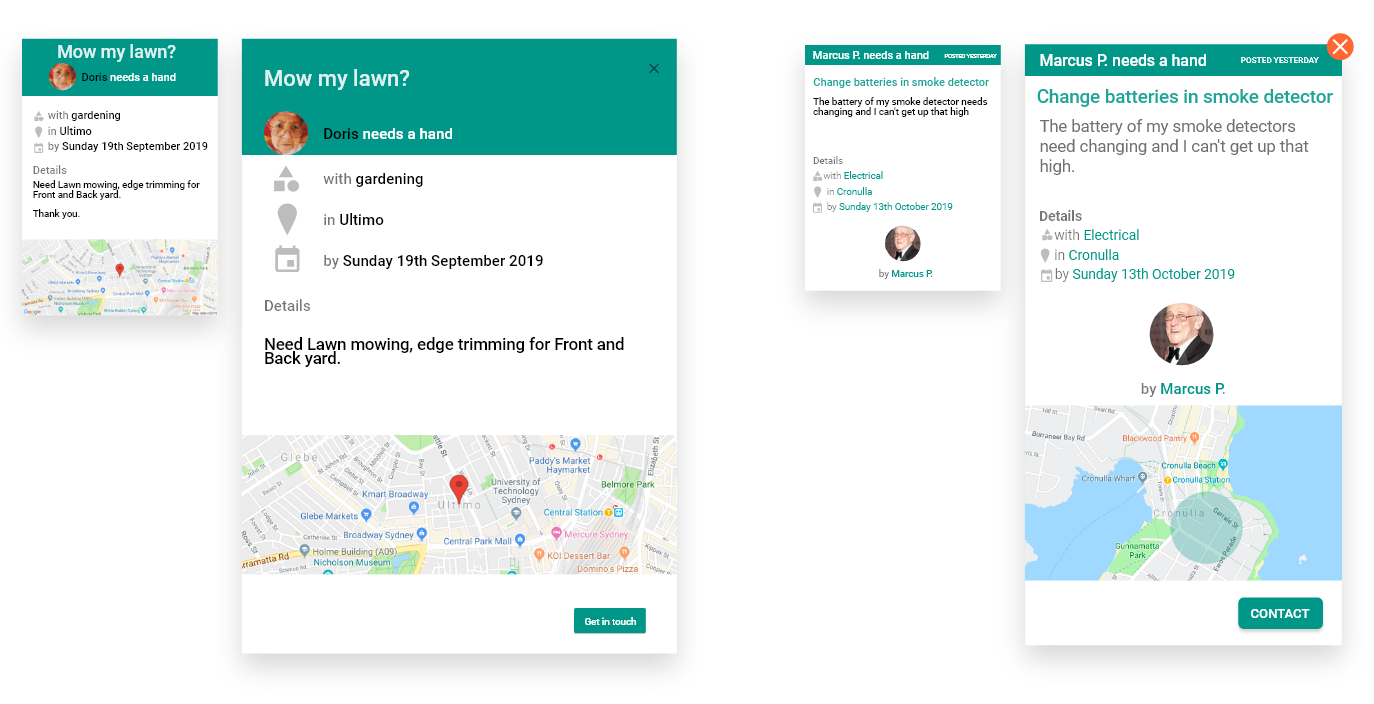
Searching for notices UI
After pressing “Finding a Need”, the drop down selection menu should appear where the original buttons were, rather than at the top of screen on a separate window.
This retains the interaction in the user’s area of focus and allows them to see the jobs being narrowed as they make selections. [NORMAN - FEEDBACK]
The title above the drop down menu would support the user’s understanding of what is happening [NIELSEN - VISIBILITY OF SYSTEM STATUS]
With all human-centered approaches to design, our solution needed to be tested by real users. However, to make the most of our users’ time ironed out superficial problems by testing on each other
Peer-designed prototype for evaluation
Proposed revisions - Quick sketches to communicate ideas
Searching for notices UI
After pressing “Finding a Need”, the drop down selection menu should appear where the original buttons were, rather than at the top of screen on a separate window.
This retains the interaction in the user’s area of focus and allows them to see the jobs being narrowed as they make selections. [NORMAN - FEEDBACK]
The title above the drop down menu would support the user’s understanding of what is happening [NIELSEN - VISIBILITY OF SYSTEM STATUS]
With all human-centered approaches to design, our solution needed to be tested by real users. However, to make the most of our users’ time ironed out superficial problems by testing on each other
8. User Testing (Part 2) - Real Users
It was time to validate our design with people, so we designed a testing protocol (consent forms, scripts, scenarios, role division) and recruited elderly (62, 65, 75, 79) Australians participants (4) for user testing.
Testing Procedure
Sessions were held with participants in their own homes, using a larger TV screen connected to a laptop running Adobe XD to emulate the touchscreen noticeboard in a “Wizard of Oz” style.
Participants were asked to complete 10 scenarios, guided by a facilitator roleplaying as a community librarian.
The formal testing was bookended by interviews: Firstly, a short pre-interview to ensure participant comfort and ask demographic questions. Secondly a detailed post-interview to ask experiential questions about their interaction.


Photos of User Testing - (Left) Facilitation and roleplaying (Right) Observing participant action

User study targets, scenarios & goals
9. What did users think and say?
We reviewed our notes and recordings until we felt like we heard what our users had to say.
We broke down problems they encountered using heuristic evaluation and summarised our insights to give direction for future design.
Positive Insights
1. User flows were generally self-guided
Participants expressed confidence after successfully completing each scenario.
2. Comfortable form factor
Participants expressed no discomfort after a lengthy session.
3. Safety concerns met
Participants were cautious but were pleased to find that their suggested safety features were already included.
4. Technologically appropriate
Participants were happy using the touchbased interface over keyboards, opting for digital independence over requiring tangible assistance.
Areas of weakness
1. Add on-boarding to system
“Users were unsure of how to interact with the notices at first, and misidentified the postings as advertisements….Proposing an animated overlay that appears like a screen-saver to assist new users.”
2. Review visual understanding
“Users did not immediately recognise the notices as posts from people asking for help…. Implement a persistent header across the noticeboard & all posts (eg. “<user> needs a hand”) to support recognition.…”
3. Add signifiers to login interaction
"Users struggled to log on with their card, although comments suggest this was due to the fidelity of the prototype being tested (through Opal cards, pay-pass, etc)…Recommending a small animation to show how and where to tap the card when the user is required or physical signifiers near the NFC pad…”
4. Revise review system
“Users also noted feeling uncomfortable about leaving a thumbs down review, especially since the expectations for volunteer work are low… A star rating with optional comments is proposed to replace the thumbs up/down system.”
5. Make language consistent
The language around the user profile seemed inconsistent with external standards and the more colloquial language used throughout the system. The copywriting should be revised to be more colloquial - i.e. my dashboard”, and “leave a review”....”
6. Rehaul information architecture.
Although all users identified their profile icon on the screen after logging on, it was unclear to all how to use the profile to post a review - or in fact how to post a review at all. Posting reviews took too many steps. Interactions should be more visible.
10. Iterating on feedback
Based our user feedback and design recommendations, we implemented small and large improvements to our product.
Redesigning the visual hierarchy of notices.
User comment
After inspecting each notice, the user commented “As a group they [the notices] aren’t clear, but individual they make sense”. When questioned about the purpose of the notice, the user incorrectly responded that people are “offering assistance”.
Interpretation
The context of the noticeboard is unclear to the participant. Even on inspection, it is not clear that the notices are requesting help.
Proposed action
Implement common headers to establish visual hierarchy (similarity & internal consistency).
Earlier notice designs by a peer
My redesigned notice
Redesigning the dashboard copy
The redesign used Google Material Design as a foundation, but modifications were made when value could be added to the user.
User comment
“I assume that [referring to the updates button] would have my jobs and history. The profile [section] is about me… and static preferences”
Interpretation
The UX writing and information architecture does not match user expectations.
Proposed action
Separate account preferences from past notices.

Revised information architecture
Overhauling the review process
Where major changes were needed, we let go of our designs and remade detailed user flows from the ground up.

Revised “Leave a review” user flow
11. The Deliverable
With our improvements implemented, we are proud to present the design-in-action video for our concept - LendingHand

Introducing LendingHand - an interactive community noticeboard which supports elderly Australians in finding a sense of value, relevance and purpose by helping them share their skills, experience and stories with their communities.
i. Speaks the user’s language
Novel systems can be confusing, so we drew parallels to make LendingHand easy to understand. Pressing metaphors like “notices”, mimicking behaviours such as “tapping on” and using colloquial language “lending a hand” reduces the cognitive load.
ii. Protects the user
We understand elderly Australians are particularly vulnerable, so we added security measures to make sure they felt safe while using LendingHand. Users must register and be verified before they are able to access personal information.
ii. Supports user capabilities
Elderly Australians have varying familiarity with technology, so we let the user choose the interaction that suits them best. Notices can be saved or submitted to LendingHand via email, text message or printed out in hard copy.
Acknowledgements
Over a period of less than three months, our team collaborated to conceptualise and design a novel interactive solution to support active ageing in Australia. From a broad and open-ended design brief, we found a clear problem and envisioned an intended experience. Through an iterative design process, validated by user testing, we delivered a solution which not only created an experience, but also included features to support our audience.
This project would not have been possible without my amazing design team, Mark, Tim, Nikita, Bella & Phil, and the guidance of our mentor Tuck.