AUSTRALIAN SIGN-LANGUAGE MOBILE APP
When compared with spoken language apps, sign language learning tools are years behind the competition.
In trying to address this, we developed GATHER - a mobile app which helps learners expand their vocabulary by allowing users to create flashcards out of their environment.

Overview
How might we create a more engaging, interactive and personalised experience for those learning Australian Sign Language?
Context
My Role
Subject: Digital Media Studio (Capstone)
Timeframe: 12 Weeks (July - Oct 2020)
Approach: Lean UX
Team: Timothy Parker, Mark Scarcella, Isabella Urquhart, Elwina Ricara
Methods & Activities:
Background Research, Benchmarking, Hypothesis Table , Personas, Affinity Mapping, Ideation, Wireframes, Prototyping, User Flows, Interviews,User Testing, Heuristic Evaluation, Figma
As per the lean UX methodology, formal roles were not assigned and we encouraged everyone to contribute to each stage of the project.
The tasks I contributed more significantly include:
Synthesising our background research into an overview and problem statement
Establishing user-flows based on perceived user goals
Wireframing of the “flashcard creation” user-flow.
Synthesizing the results of our heuristic evaluations and proposing revisions.
Synthesising the results of our user study and processing affinity diagrams.
Designing a visual palette and style-guide for our high fidelity UI.
Directing the in-action film and communicating our vision.

Summary
For my capstone subject, my team was tasked with creating a working prototype which “reimagined learning”. Choosing Australian Sign Language (Auslan) as our area of interest, we created GATHER – a mobile application that supports the learning of Auslan through the creation of flashcards from a user’s environment.
Over twelve weeks, we utilised a Lean UX approach to develop GATHER from concept to functional prototype. We iteratively refined our concept by taking the product through three development cycles - gaining feedback from user testing and an external industry panel.
The final deliverable came in the form of a design-in-action video which communicates our intended experience.
Constraints
The product must be digital and support learning in our chosen area.
The product must be presented with some demonstrable functionality
The team must apply a lean UX framework.
Assessment is made at the end of each sprint.
Government guidelines for managing COVID-19 must be adhered to at all stages
No budget was provided for research or external development.
The Challenge
Produce a working prototype of a digital technology which could “reimagine learning”.
The project must follow a lean UX methodology.
Problem Statement
Existing Auslan learning tools lack the interactivity, personalisation and immersiveness afforded by current technology, discouraging people from investing time, money & effort.
Vision
To build an interactive Auslan learning tool which immerses users, engaging them in their learning and thus helping them increasing their language proficiency.
Outcome
We built a mobile app which utilises image recognition and database scraping to allow users to create custom flashcards from their environment.
Design Process
Our process modelled that of a lean start-up, utilising an agile management with build-measure-learn cycles to iterate from concept to functional product.
Lean UX emphasises rapid test-driven prototyping for the purpose of learning - with each cycle shaping the product, but also the understanding of the problem space.


Research
We read articles, papers and examined existing products to understand the existing experience.
We established a problem space, a potential audience and a concept.
First Iteration
We materialised our idea, creating a paper prototype from wireframes.
We conducting usability evaluation.
We identified flaws and proposed changes.
Second Iteration
We built a clickable prototype.
We tested assumptions, with interviews and user testing.
We adapted our product to our improved understanding.
Third Iteration
We made a functioning app and prepared a pitch.
We received feedback from an industry panel.
We took on-board feedback and addressed criticism.
Research & Scoping
Before embarking on our first development cycle, my team allocated a week to establish a clear understanding of our chosen area and the scope in which we wanted to approach it.
Following the Lean UX framework, our initial exploration came in the form of desk research - to create a base-level understanding of the existing learning experience, the tools and services on offer and potential users.
We defined defined a problem statement to encapsulated these findings. Any assumptions made thus far were recorded in our “hypothesis table” for later validation.
Auslan
With sign language gaining more visibility due to the pandemic, we picked sign language, specifically Australian Sign Language (Auslan), as our area of interest.
Reading academic articles and newspaper entries, we gained an understanding about how the pandemic had negatively impacted Auslan users and how there has been a heighted interested in learning the language.
We identified moral and societal impetus to improve accessibility and spread awareness of Auslan.
Summarising the contextual relevance of sign language and impetus to promote its usage.
Motivations
Building on social impetus, we expanded to four key motivations to design for sign language.

Unserviced market opportunity - emergent demand due to the COVID-19 pandemic, current solutions are overwhelmed or unsuitable.

Improves societal communication - Learning sign language improves an individual's communication skills and provides cognitive advantages that come from being bimodally bilingual

Shared responsibility - to create a more equitable society, raising awareness about the DFHH community, directly makes it easier for DFHH people to communicate.

Long term opportunity - face masks may become more prevalent, even after the COVID-19 pandemic ends
Examining the existing experience
By examining existing services and tools on offer - we sought to understand the existing experience and identify potential areas of opportunity. From our research, we identified three primary steams of content delivery.
Language Courses
Paid accreditation from Tafe or key deafness-related bodies. Typically a face-to-face commitment spanning from weeks to months.
Video Tutorials
Recordings demonstrating Auslan signs for learns to mirror and copy. Often created by the community and uploaded to YouTube, Instagram, etc.
Online dictionaries
Web applications which allow users to type in a word to find a corresponding sign.
Whilst formal courses are the primary form of Auslan learning deliver, they have a degree of rigidity - requiring commitments in time and money.
Recognising that existing systems were created and supported by the Deaf and hard of hearing community, we steered away from an “all-in-one” solution. We wanted to create an experience which could supplement existing systems rather than replace them.
Existing applications
When looking at digital tools (Auslan apps and web dictionaries), it was clear existing apps were outdated and 5 years behind successful products like Duolingo and Rosetta stone.
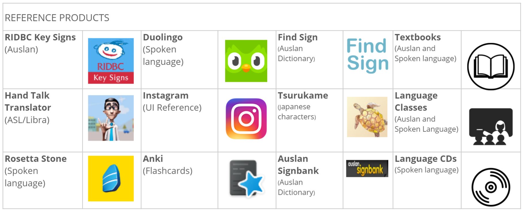
Successful applications such as DuoLingo served as inspiration for our own implementation.
Spoken Language Apps

Duolingo and Rosetta Stone
Contemporary UI
Interactive quizzes and engaging features (Rosetta Stone Seek and Speak feature)
Social features to connect with other learners
LACK personalised learning experience
NOT servicing Sign Language
Sign Language Apps

A variety of international web & mobile apps for sign language.
Signbank (Auslan) - Web based Auslan dictionary
RIDBC Tutor App (Auslan) -Video tutorial app, with not interactive features
Hand Talk (ASL/Libra) - AR sign translator, not learning focused
It was clear that the technology which made certain apps successful had yet to be translated to Auslan. Our hypothesis was that the lack of interactivity and personalisation in existing apps would leave users feeling unengaged in their learning material.
Choosing a demographic
Within the spirit if “Auslan for All”, we considered a wide range of potential users.
Due to challenges of sourcing interpreters and Deaf & hard of hearing participants during peak Covid-19 lockdown, we opted to focus on people who may not necessarily be hearing impaired.
To promote the idea of a wide range of users, we created two different proto-personas with contrasting motivations for learning Auslan.
The Advocate - learning Auslan to communicate to loved ones, time efficiency and proficiency are important.
The Curious - Learning Auslan for leisure, more likely to engage in fun activities.
Solving one problem well
After some deliberation further into the project, we opted to make Maria (the Advocate) our primary persona for our project. We felt her needs were more apparent and would better inform our design.
Key Motivation & Behaviours
Need Auslan for personal (i.e. family) or professional reasons (e.g. working as a nurse).
May already be learning Auslan
Existing solutions to not fit into their schedule or needs.
Wants learning to be flexible, engaging & tailored to own goals
Pain Points
Lack of time - Becoming proficient in AUSLAN requires significant investment; two years of formal training and high cost.
Lack of immersion
- Practising AUSLAN is difficult when you don’t know anyone else that uses the language.
Lack of engagement
- Existing tools and resources lack interactivity and engagement afforded by current day technology.
Bringing the research together
To keep the team focused, I encapsulated the findings of our research into a problem statement.
A need to spread awareness and accessibility about Auslan
Inflexible learning programs - rigidity, high time & cost commitment
A lack of interactivity, personalisation & immersion.
Problem Statement
“It has been shown that it can take up to two years to be proficient in Auslan, even with formal training. Whilst there are many resources to support learning Auslan, these resources lack the interactivity, personalisation and immersion afforded by current technology. This results in a steep learning curve for Auslan - discouraging people from investing their time, effort, and money.”
LEAN CYCLE 1
Ideation, prototyping & evaluation
The focus of our first development cycle was to come up with a solution and translate that vision into user goals and then wireframes. To identify early usability issues, before we moved to software, we performed a heuristic evaluation on our paper prototype
Brainstorming
Exploration & Inspiration
Our problem statement identified interactivity, personalisation and immersion as potential metrics for a solution. We hypothesised that these factors were likely to increase a user’s engagement - leading to better learning outcomes.
Interactivity + Personalisation + Immersion = Engagement
Whilst discussing engagement, we found two sources of inspiration:
Learning in a foreign country
One of the most effective ways to learn is to spend time in a place where you are constantly exposed to the language.
Sticky-noting around the house
The practise of labelling common household objects with its foreign translation. The repetitious exposure to the word and the association with the object helps commit the word to memory.

Placing stickynotes around the house to learn new words
From these two ideas, we hypothesised than incorporating one’s physical environment into language learning may improve learning outcomes - our challenge was to bring that learning experience to language which is not spoken or written.
Themes
Spreading awareness
Supplementing existing study
Interactive, Personalised & Immersive
Flexible commitment
Spatial Engagement
The Idea
We envisioned a product which would allow users to mark, identify and match the corresponding sign for objects in their chosen environment - akin to sticky-noting things around the house.
Allowing users to then “collect” objects and their corresponding signs (as a flashcard) introduces gamification elements, encouraging users to explore their environment to expand their library. Unlike existing web-apps where the users simply types the word, the experience of finding new vocabulary is interactive, immersive and engaging.
Collected flashcards can then be used for short interactive activities such as quizzes and games - making revision flexible, fun and at the user’s convenience.
A user’s vocabulary library becomes a reflection of their environment and interest: revision is personalised and directly relevant to a user’s life. Creating mental associations towards existing possessions may help commit learning to memory.
The lack of required prerequisite knowledge means the application can be equally utilised by absolute beginner and intermediate learners looking to supplement their learning. Sharing/trading flashcards and libraries introduces a social element - which is critical to language learning.
Included links to articles and other key Auslan authorities can help spread awareness of the language.
We collected proposed features and ideas into a hypothesis table, which we progressively updated throughout the duration of the project.
While not every feature would be designed for a MVP, a start-up may endeavour to progressively add these features based on a value-to-cost consideration.
Hypothesis Framework
- WE WILL BUILD ...
GATHER is a mobile app that supports the learning of Auslan and encourages its use within the wider community, by supplementing traditional learning styles with a focus on gamification and engagement.
- TO SOLVE...
It has been shown that it can take up to two years to be proficient in Auslan, even with formal training. Whilst there are many resources to support learning Auslan, these resources lack the interactivity, personalisation and immersion afforded by current technology. This results in a steep learning curve for Auslan - discouraging people from investing their time, effort, and money.
- MEASURED USING...
With GATHER, our users will increase their proficiency with Auslan, demonstrated by their improved vocabularies. Our users will remain more engaged in their learning when compared to those who do not use our application.
Mapping to wireframes
We had a rough idea of how our application could be used, the next challenge was to define specific features for us to focus our efforts on.
To approach this challenge, I abstracted the way the application could be used into four core interactions - “Create”, “Review”, “Explore” & “Read”. For each user goal, I then began mapping out screens and individual flows.
Create - Users can create personalised flashcards.
Review - Users can revise their existing flashcards in an unstructured manner.
Engage - Users can engage in interactive activites to learn new words or practise existing ones.
Read - Users can access relevant articles and links about Auslan.

(Left) “Interaction Statements” (Right) User flow diagrams - mapping out each stage of a task
User Flows
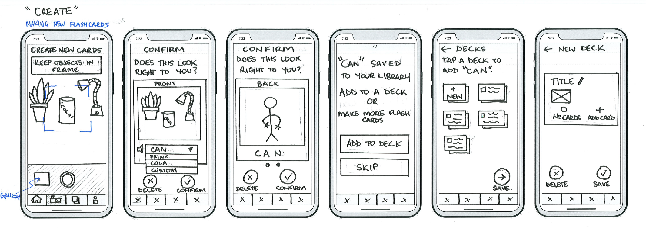
I created user-flows mapping out the interactions and steps users must complete in order to accomplish a particular task. The user-flows were then used to guide the creation of our paper prototype
User flow for engaging in gamified learning

User flow for creating a flashcard

User flow for reviewing flashcards

Paper Prototype


Heuristic Evaluation
We tested the usability of our prototype by applying our own usability guidelines - based upon Norman’s Design Principles and Nielsen’s Usability Heuristic.

Using our prompts, we performed individual evaluations upon our paper prototype before meeting to share our findings screen by screen.

Evaluation findings
Our evaluation findings were collated then synthesised into six key insights.
Overall, the UI is cluttered and unfocused
User flows are not sufficiently supported by text and feedback
Users are not able to access what they want quickly
The core feature (flashcard creation) of the app is unclear to new users
The current layouts of media (videos/gifs/photos) are difficult to view
Interface elements lack consistency, creating unnecessary cognitive load
INSIGHT 1:
Overall, the UI is cluttered and unfocused
ACTION:
Reduce unnecessary UI elements and noise to improve user focus
Mode like ‘photo capture’ and ‘quizzes’ are now full screen, hiding the navigation bar, for greater immersion
Removal of ‘breadcrumbs’ and redundant titles
Removal of audio options on cards

The removal of labels and menus leaves more screen real estate for the learning content
INSIGHT 2:
User flows are not sufficiently supported by text and feedback
ACTION:
Support user understanding through text guidance & graphical feedback
Instruction copy is more contextual and casual in tone
Titles removed when redundant
Tick, ‘well done’ and “success” icons

(Left) - Iconography added to convey ideas more quickly (Right) - Instructional copy is more contextual
INSIGHT 3:
Users are not able to access what they want quickly
ACTION:
Allow users to find what they want faster
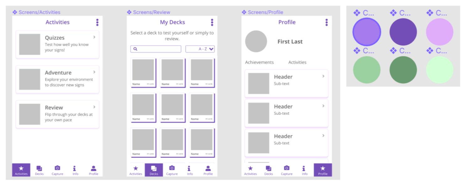
Added features to help find and organize content (i.e. elastic search and sort/filter/lozenges)
Toggles between grid/list layout for user preference
INSIGHT 4:
The core feature (flashcard creation) of the app is unclear to new users
ACTION:
Establish flashcard/deck creation as most important feature
Central button in navbar,
Text encourages adding to deck
Home is now “activities”

The informational architecture and menu copy has been revised.
INSIGHT 5:
The current layouts of media (videos /gifs /photos) are difficult to view
ACTION:
Optimise screen real estate/interactions to support videos/gif
Multi-choice gifs presented as carousel
Swiping left & right to flip cards, up and down to change cards
Less actions on card in ‘review’

The lay out of images and gifs has been reconsidered to make them easier to view
INSIGHT 6:
Interface elements lack consistency, creating unnecessary cognitive load
ACTION:
Consistency across UI
UI buttons have been made consistent
Edit pencil icon & kebab menu across cards
Cards made more consistent
LEAN CYCLE 2:
Iterate & User Evaluation
With our concept a little more fleshed out, it was time to challenge our assumptions with potential users.
The focus of our second development cycle was to test whether our assumed pain points were valid and whether our solution was appropriate.
We created a user testing protocol and mocked up a clickable prototype - addressing any usability issues discovered previously. Testing was held remotely and both validated our concept whilst highlighting new areas to address.
Updating the prototype
Choosing a design language
Before fully committing to mocking up a prototype for user testing, we established a visual style for the application - creating a design system and corresponding components.
Our chosen design reflects our focus:
Minimal Cognitive Load - Minimalism, reduced colours, shadows etc. Placing the focus on the learning content - the images and the signs.
Accessibility - WCAG AAA Colour Contrast, Labels. Hearing impaired users are more likely to also be vision impaired.

Exploration of colours, line weights, drop shadows and composition.
A reduction of colours and borders reduces the cognitive load upon the user
Clickable mock-up
Finally, we created and linked screens to match the scenarios* required for our study.
User study
We planned a user study by drafting questions for contextual inquiry, scenarios for user testing, consent forms and a selection criteria for participant recruitment.
Our goal was to [1] validate our problem space and persona, [2] the suitability and desirability of our product and [3] the usability of our prototype.
Protocol
We planned a two-part user study:
-
Semi-structured interviews - We interviewed our participants to better understand their experiences learning languages and the challenges they encountered. We also discusses their involvement or interest in sign language.
-
Scenario-based user tests - We drafted a set of scenarios and mocked up a clickable prototype for them to use. This would test the discoverability and understanding of our prototype.
Participant Screening
Participants were selected based on their similarity to Maria, our primary persona. Favourable experience included:
Experience learning Auslan or general language enthusiasts
Experience working full-time whilst caring for children
Or work within the disability/speech pathology space
Ultimately, ten (10) volunteers were tested were recruited for virtual user study sessions - a mix of parents, students, speech pathologists, nurses and language learning enthusiasts.
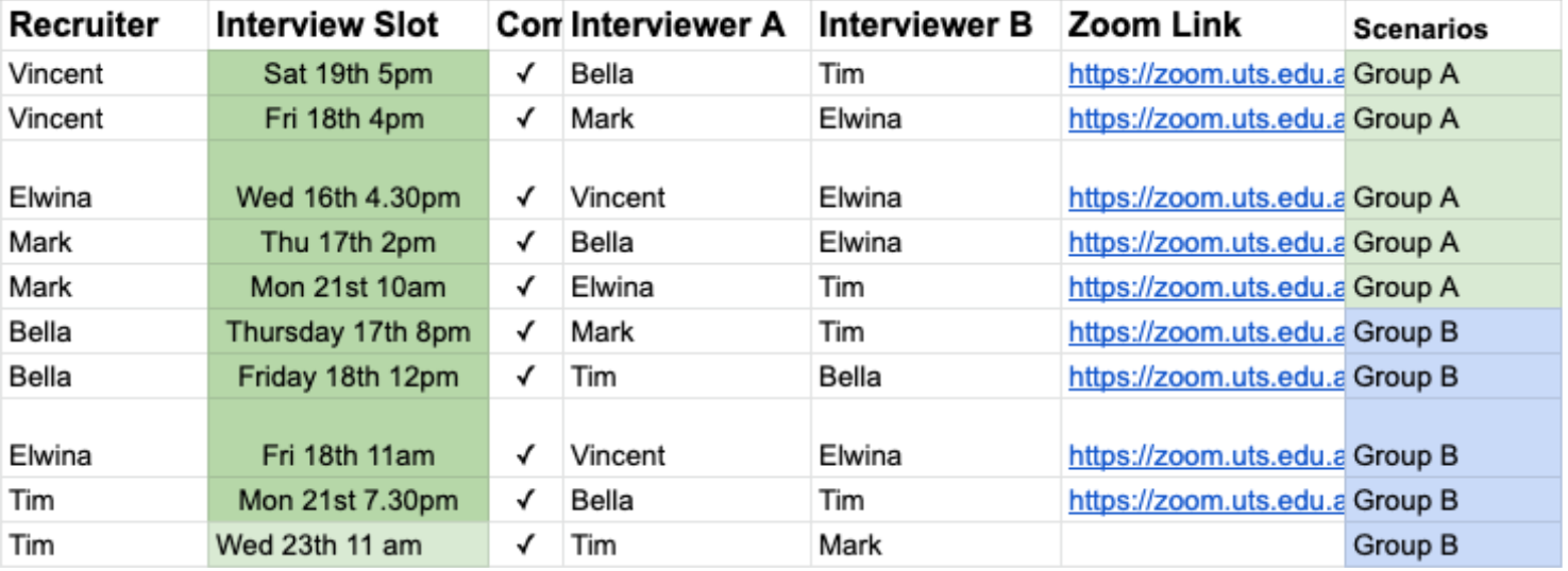
We interviewed and tested ten study volunteers utilise Zoom and a web-based prototype.
Mid-study Adaptions
Early into our user interviews, we recognises that certain scenarios and aspects of the app would cause problems for our participants. Thus, we remedied these problems for following tests.
We removed the fist scenario entirely - users always began exploring features planned for subsequent questions.
We updated copy to make it more explicit that the camera was accessing photos from the camera roll - compensating for lack of functionality in the prototype.
We added a loading screen to indicate that the app was recognising the objects in the photo - early testing showed that users were not making the connection between an object in the photo and the Auslan sign they were seeing.


Analysing the data
From the data we collected, we went through three rounds of affinity mapping to produce both user experience and usability insights about our product.


Findings
From the analysis of our user interviews and testing, we arrived 12 findings - a mix of usability and user experience insights.
Usability Insights - Reveal areas to address in the prototype
User Experience Insights - Allow us to validate or refine our persona & hypothesis table.

We used user’s comments and actions to understand the context of our insights, and then discussed how we might address each area.
Usability Insights
1. Feedback can be amplified
Feedback during the quiz was insufficient, leading to confusion of the user.
2. Revise carousel indicators
Test participants struggled to recognise the interaction of swiping to navigate through "carousels"
3. Revise info-hierarchy.
Participants displayed confusion when finding different paths to the same destination.
4. The copy needs to reflect the user’s mental-model.
The copy used was often too vague for the user to immediately grasp what it represented.
5. System status is unclear
The user's objectives in certain flows is hindered by unnecessary customisation options.
User-Experience Insights
1. People already use forms of non-verbal communication
This insight reiterates the need for flexible learning opportunities around non-verbal communication.
2. Design with, not for the community.
This insight reinforces the need for inclusive, participatory design, and will be a key part of the development process in the future
3. Traditional learning courses do not meet all needs.
This insight supports the act of learning in small increments, which our product promotes.
4. Learning Auslan requires a need.
This insight clarifies our Persona, focusing less on the idea of time but emphasizing their need of Auslan.
5. Diverse learning for diverse learners.
This insight reinforces the application’s position as a supplementary learning product, to be used in conjunction with form an education, not as an alternative to it.
6. Gamification leads to education which leads to learning.
This insight highlights the viability and desirability of having an engaging teaching tool that goes beyond traditional learning practices.
7. A language is more than just words.
This discovery supports the inclusion of a ‘community’ aspect to the application.
8. People are fine to take photos in public but do not want to share them.
This insight will inform how we move forward with the application’s social and community aspects.
Response to insights
These are some of the ways in which we adapted our strategy and prototype using the insights from our user research.
USABILITY ISSUE 3:
Revise information hierarchy.
HOW WE REFINED THE PROTOTYPE
Decrease the amount of destinations in the app (eg, do we need Activities, Info, Profile all separate?)
Make the capture 'nav destination' more prominent and obvious as our main feature
The order (hierarchy) of posts on the activities destination need to be revised or eliminated

Changes to navigation bar hierarchy to improve user guidance.
USER EXPERIENCE INSIGHT 4:
Learning Auslan requires a need.
HOW WE ADAPTED THE PROJECT
From our research, we find that the necessity for a form of non-verbal communication in the users’ personal or work lives is what drives the user to learn sign language. This insight validates our Persona, Maria, who needs to learn Auslan as:
a mother, to communicate with her child who is DHH
a nurse, to communicate with her patients at work and improve work efficiency
With a better understanding of our audience and user needs, we were able to update our persona. Instead of focusing on the lack of time, we emphasised a drive to learn for her family and work.
LEAN CYCLE 3
Development & Panel Evaluation
For our final cycle, our goal was to prepare a video presentation for our pitch and utilise any feedback to refine our design.
We turned our clickable mock-up into a working application running on Unity which was used for our demonstration.
Developed features
We developed 3 functional features to demonstrate at our panel presentation - as per the brief.
We selected these features using the criteria of [ 1 ] importance and [ 2 ] feasibility.

Image Recognition using Google Vision API
Users can take a photo of an object, which is then sent to the Google Vision API performing object localisation to annotate the object, giving it a name
This feature allows users to take ownership of the images in their flashcards, which is core to the language immersion offered by Gather

Database Scraping
Taking the object name, the Signbank dictionary is then searched and a video of the object being signed is returned.
If users don’t want to take a photo, or they want to know the sign of an intangible word, a direct word search can be done
This feature allows seamless integration to a source of truth - the Auslan Signbank - to provide accurate signs to users.

Creating a flashcard
After the object in the photo is identified and a matching sign is found, the original image, object name, and sign are packaged into a flashcard. Users can add these cards to decks for easy organisation and revision.
Cards can be renamed (and signs re-applied), and moved between decks to best aid users in their learning

Panel feedback
After pitching our project to the panel, we met as a team to consider the feedback we had received - which we addressed in our final video.
We found the feedback revolved around four themes:
Non-Object Learning
The Importance of Photos
Clarity of MVP and Features Pipeline
Taking Photos to Search vs. Typing vs. Other Inputs
Adding text input support
Whilst the process of taking photos is core to the interactive experience and improved learning experience - we acknowledge the panel’s feedback and want to better support diverse learning styles.

Version 1 (Popup Window) - We reasoned that adding a pop-up to a core user-flow would break the user’s flow state and add confusion.

Version 2 (Widget) - We reasoned that implementing text input options as a widget would hide the feature from those that needed in most (users who are short on time).

Version 3 (Same Screen Input) - It is not possible to place the text field on the bottom half of the hard without it being obscured by the keyboard. Placing it above the camera would over emphasize that feature.

Final version - By change the relative size of the options, we were able to encourage use of the photo capture feature without hiding the text input alternative. Tapping “skip” moves the user to the next screen, allowing them to enter text.
OUTCOMES
Deliverable & moving forward
The following video was our final deliverable for the project.
Our story, beginning after address judge feedback, sets the scene by highlighting our interest in Auslan and the importance of language immersion. After examining the landscape of existing language tools and challenges our target audiences faces, we introduce GATHER .
Video Outline
2:06 - Why Auslan?
2:47 - Importance of Immersion
3:16 - Existing learning systems
4:00 - Target audience / User needs
4:44 - Product-in-action
6:07 - Working functionality
7:33 - Planned functionality
“GATHER the signs you need, from your photos, for your goals.”
Next steps
Were the project to be continued, the next stages would be critical for approaching MVP status.
Consulting with key Deafness-related bodies for support and community buy-in.
Completing interactive revision modes - Quizzes, Sign “scavenger” hunts, “Quickflash”


Hi-Fi Mockups of planned features
Reflection
Designing GATHER through this double-credit capstone project was a welcome opportunity to apply UX methods on a more extensive scale. I was able to draw on techniques introduced in previous subjects (user testing, heuristic evaluation, wireframing, personas, etc) and use them in a mock startup/business setting.
Lessons learnt
From a learning perspective, I gained first-hand experience applying a Lean UX approach and have a clearer understanding of methodologies strengths and weaknesses.
Whilst I would advocate against using a Lean UX approach on future projects, below are some lessons I learnt from the challenges we faced.
A methodology is only as useful as its fit for a project.
Lean UX emphasises “validated learning” as the primary of each development cycle, in order to steer the next phase of development. For our project, these output became secondary to polished, formatted work at the end of each sprint - limiting its usefulness.
A prototype does not need to be complete to be useful
Taking a moment to ask “What is the cheapest & lowest fidelity prototype I can build to test my hypothesis?” resources especially when a budget or deadline is tight. Build to testing specifications.
Were I to repeat this project, I try to have clearer testing goals in mind before discussing other features.
Assumptions aren’t inherently wrong (but carry a risk!)
Lean UX advocates a “build first, test later” approach which does mean development is based on assumptions. When assumptions are wrong, it may be possible to retrofit the product if the project allows it.
This approach could be useful for a startup trying to develop a useful product, rather than solve a specific problem. Or it could be useful whilst waiting for research budget.
Storytelling is difficult without structure
As our prototype changed with our problem space, it became increasingly difficult to connect the dots between where the project started and the current iteration of the product.
What I would propose in future is to pin-up the insights from each stage of research as one would a persona to keep the team focused and decisions in view.
Whether its testing an early prototype or pitching to potential stakeholders - its best to as explicit as possible, rather than rely on someone to connect the dots.
It’s better to be explicit then leave things unclear
Overall, what I have taken away is a more strategic but also flexible view with regards to both the process and outputs of UX Design.
Acknowledgements
I would like to thank Tim, Mark, Bell & El for their wonderful enthusiasm and incredible work ethic throughout the project. I would also like to extend my thanks to our lecturer Jeanette Durick and our guest panel (Anna Douderina, Andre Kakos, Kelley Johnson) for their guidance.